Annie and Bruno, my Chihuahuas!
Education
● Master’s of Science in User Experience Design (Kent State University – 4.0, May 2024)● Bachelor’s of Arts in Political Science, Minor in Gender Studies (University of Mount Union, graduated Summa Cum Laude, May 2018)
Hi there! My name is Royal (he/him).I am currently the Digital Communications Coordinator for the Democratic Association of Secretaries of State (DASS)! In the past, I worked as an intern for BerlinRosen and the Federal Trade Commission.Thanks for stopping by!
skills
| ● UX/UI design | ● User research |
| ● Graphic design | ● Video & audio |
| ● Website design | ● Analytics |
| ● Social media | ● Copywriting |
| ● Management | ● Client relations |
| ● Training | ● Hiring |
programs
| ● WordPress | ● Figma |
| ● Canva | ● MailChimp |
| ● Clip Studio Paint | ● Audacity |
| ● Slack | ● Discord |
| ● Microsoft Office | ● Google Suite |
DASS Social Media
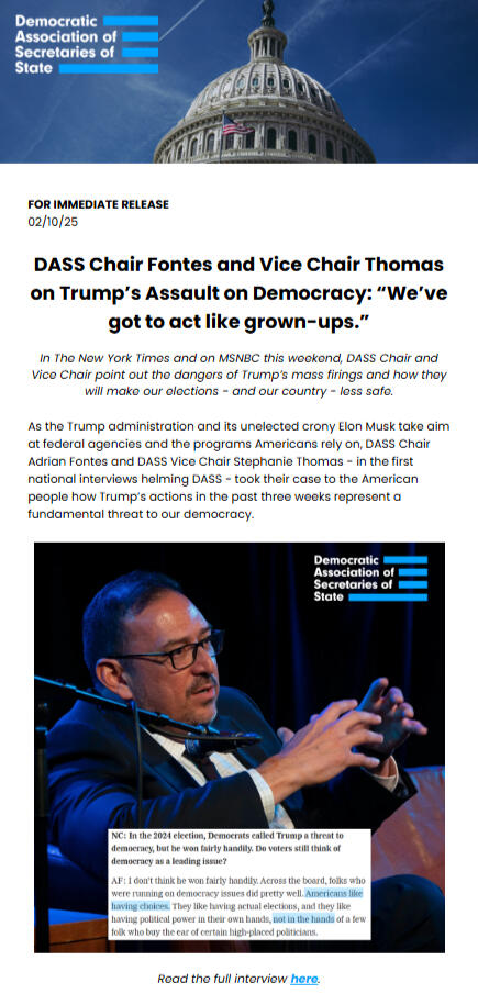
As the Digital Communications Coordinator for DASS, I am responsible for creating graphics as well as videos with the help of our video intern.
4:5 examples

A simple 4:5 graphic depicting common household products that would soon be affected by increased Trump tariffs.

A 4th of July graphic.

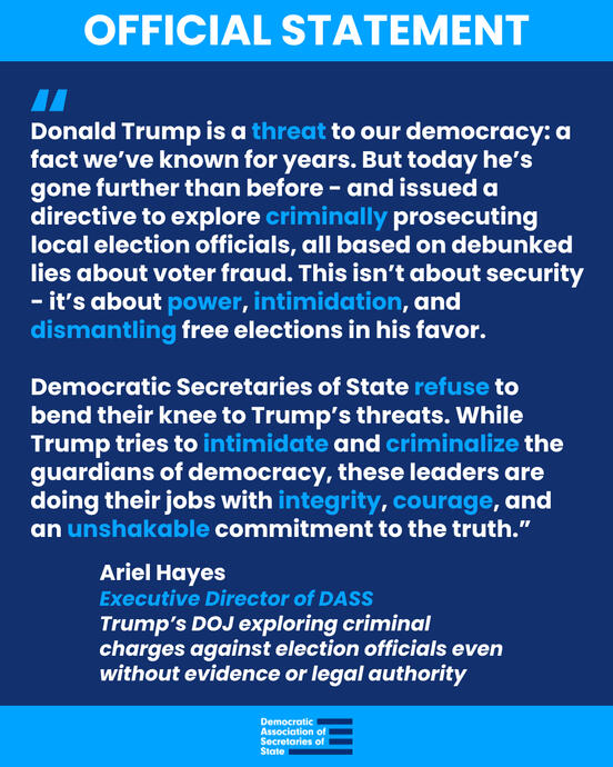
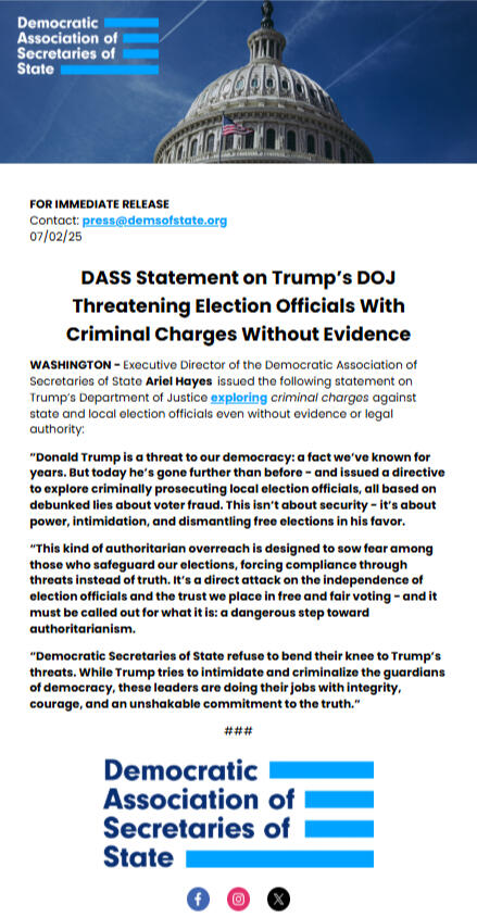
A 4:5 "official statement" type graphic featuring a press release from DASS.

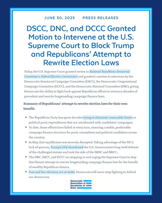
A press release graphic using DSCC elements.

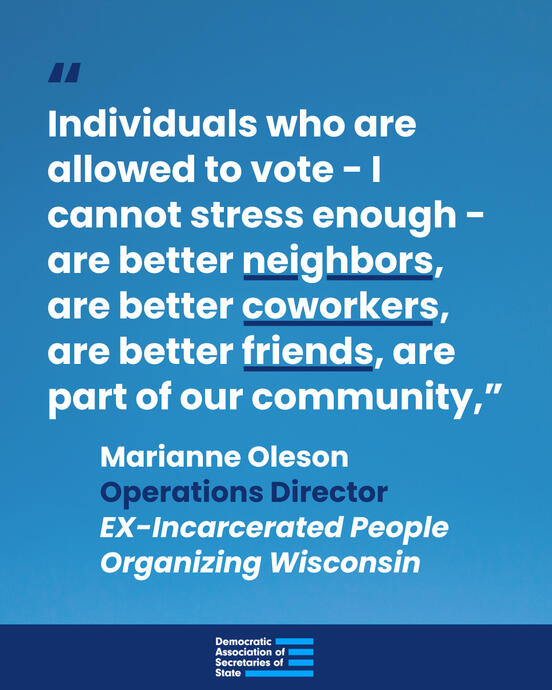
A 4:5 quote graphic with DASS branding.

Untitled
1:1 examples

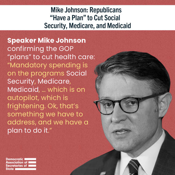
A combination headline/quote graphic of Speaker Johnson.

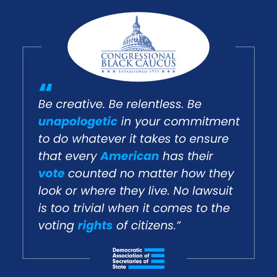
A sleek, modern organization quote graphic featuring the Congressional Black Caucus.

A fun, floral, spring-themed Mother's Day graphic.

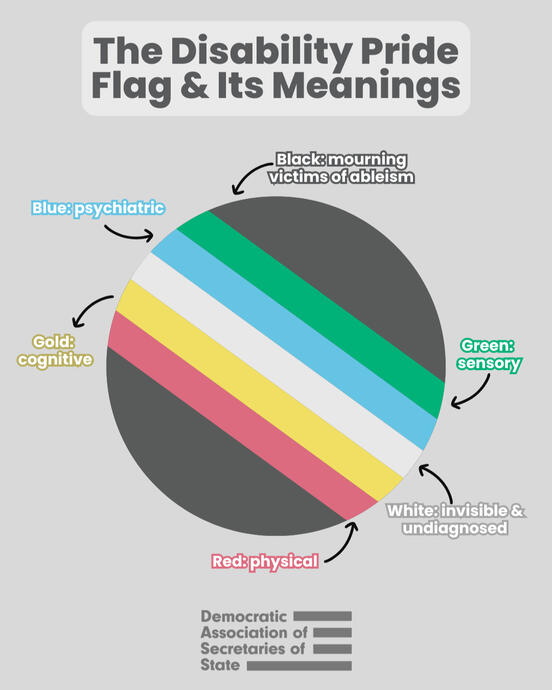
A collection of photographs featuring disabled people with a variety of experiences in honor of Disability Pride Month (July).

A 4th of July graphic incorporating photography, branding, and in-house graphic design elements.

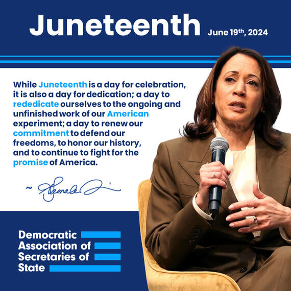
A Juneteenth graphic featuring Vice President Harris and her quote about the day's importance.

A more advertisement-esque graphic, announcing DASS' store launch.

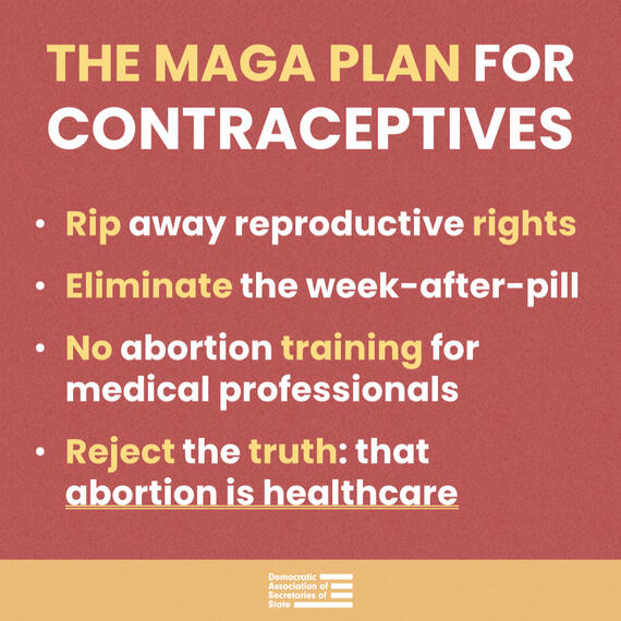
A summary graphic calling out Project 2025's plans for reproductive rights and abortion.

A graphic calling out Trump's wannabe Vice President picks (at the time of the graphic's creation).

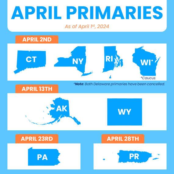
A graphic depicting the upcoming primaries for April 2024.

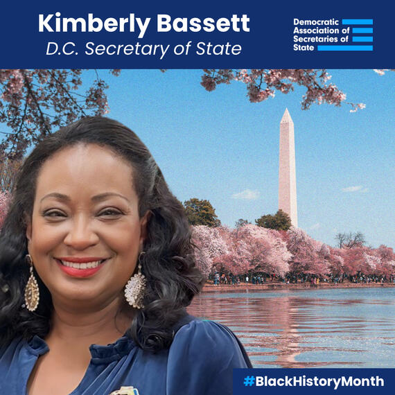
One of the Black History Month graphics I created to celebrate Black Democratic Secretaries of State.

A #HelpAmericaVote graphic to increase awareness of the campaign and encourage eligible voters to register.

One of our election worker protection graphics.

A graphic for Martin Luther King Jr. Day.

An anti-GOP graphic created ahead of one of the 2024 Republican debates.

A graphic listing DASS' organization/campaign goals for 2024.

One of the graphics posted during Christmas week, thanking postal workers.

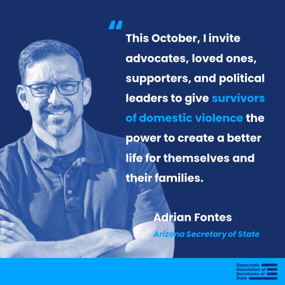
One of my quote graphic templates, used this time for Sec. Fontes.

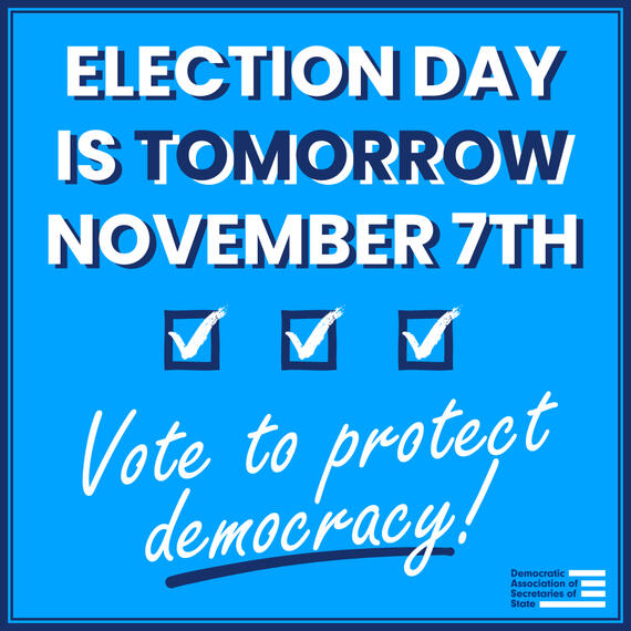
An reminder/announcement graphic for Election Day, 2023.

A rainbow-themed graphic to celebrate National Coming Out Day.

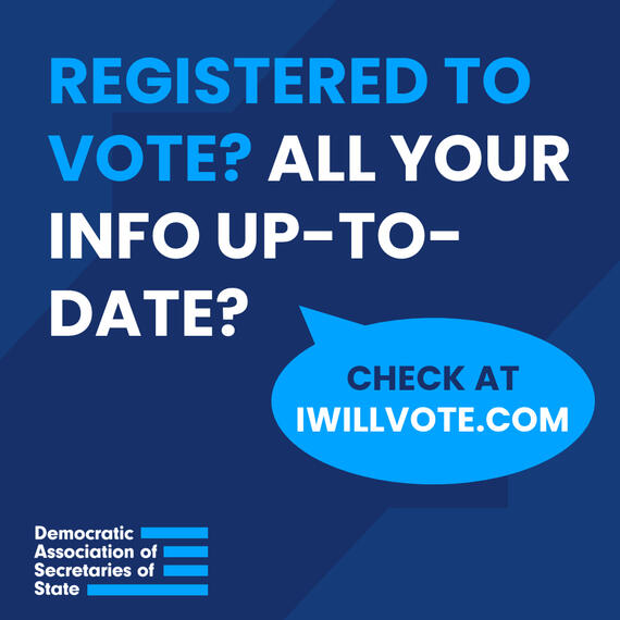
One of my earliest graphics made for DASS, a CTA reminding viewers to register to vote.
MSNBC - Trump Gaggle
Maddow - Denialism
CNN - Sen. Johnson
Ballot Box Briefing
DASS mailchimp
I also created the DASS MailChimp email template, sending out email blasts to over 300+ subscribers to the DASS Press List.
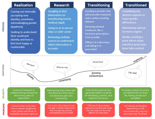
Transmasculine Transitioning
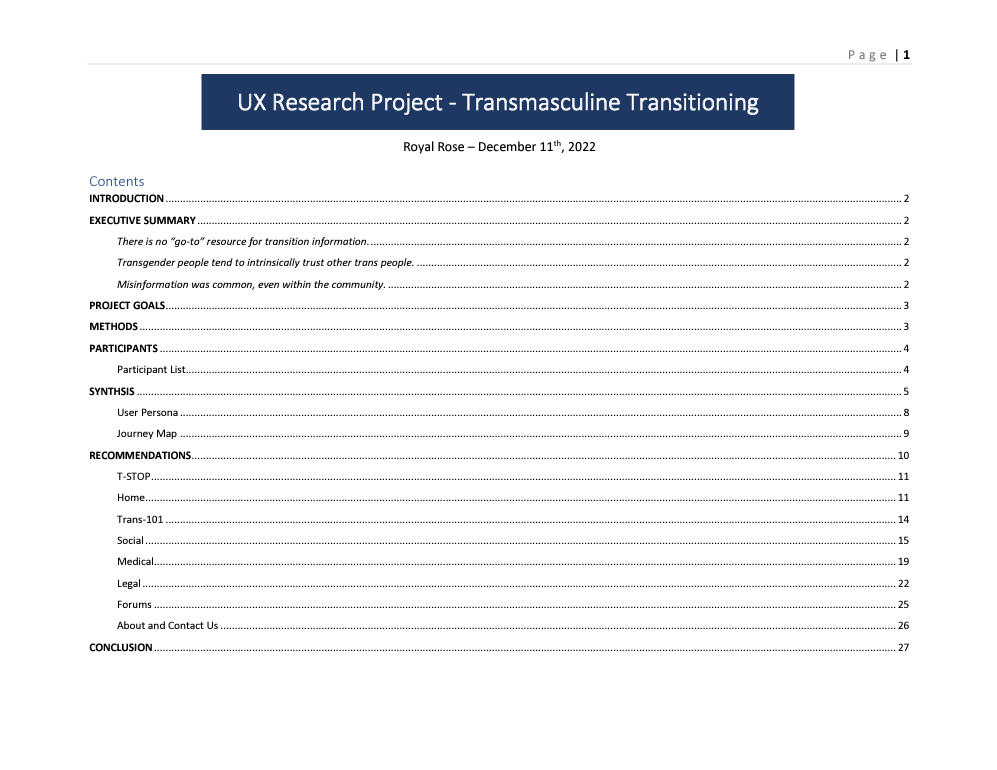
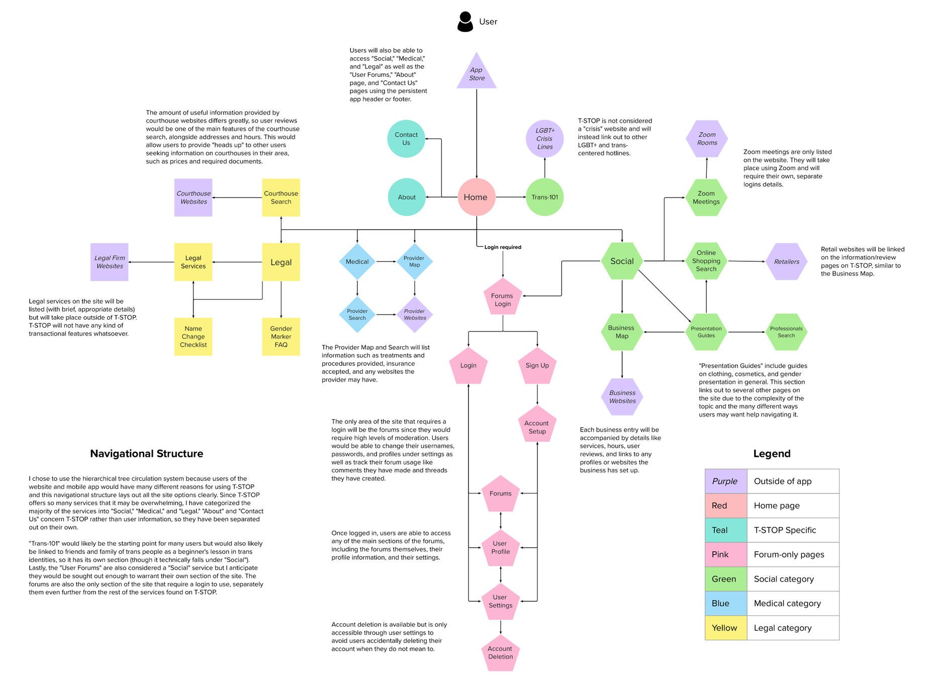
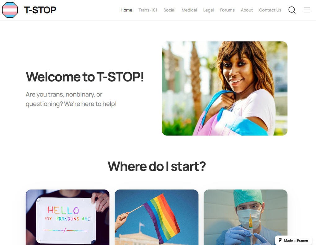
For this project, my class was given the freedom to choose our own proposals, and I chose to research transition resource access.The document linked here is the final report for this project and includes the introduction, Executive Summary, research goals and methods, participant demographics, full data synthesis, User Persona, Journey Map, and finally, my recommendations. My findings for this project culminated in my creation of a mockup site that I entitled T-STOP, which I would go on to make into an app prototype.Note: Identifying information has been removed for participant privacy.
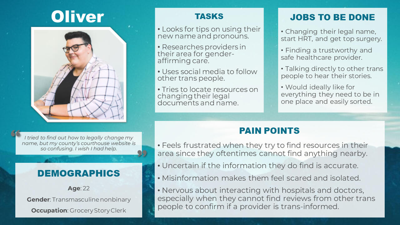
Persona: "Oliver"
The persona used for T-STOP, created from research interviews from the above project. Profile picture is courtesy of Unsplash.
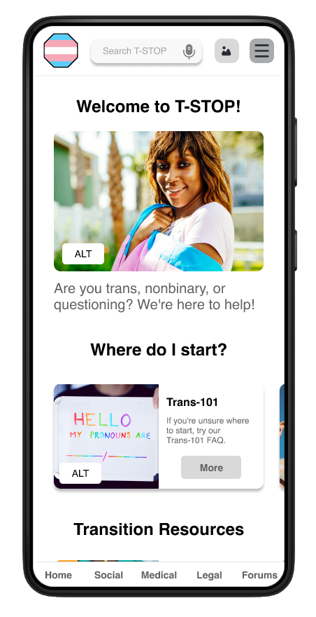
T-STOP Mobile App Prototype
The aim of this project was to create a mobile app, either native or cross-platform, that completed or helped a user complete some sort of service.After several weeks of design, I finally completed a fully interactive T-STOP prototype in Figma with over 40 screens and 50 overlays.While my initial research was focused on transmasculine users, T-STOP was ultimately crafted to be useful to anyone, even cisgender people who may be looking to support a loved one. I incorporated accessibility features wherever possible (such as the use of alternative text for images) and included as much functionality as I could within the limits of Figma prototyping technology.
Site Accessibility Evaluation
Click here to view this project!
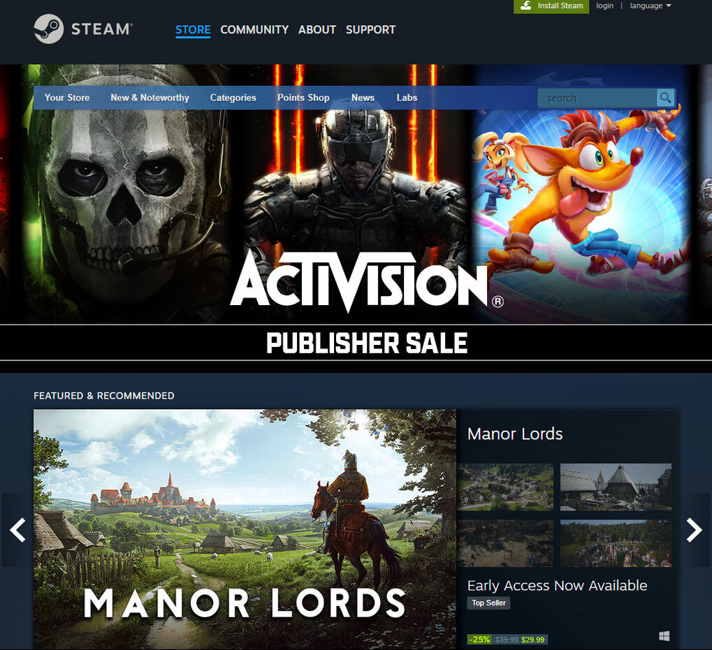
This project aimed to evaluate the accessibility of Steam.com.The goal of this accessibility evaluation was to determine if the site is compliant with the Web Content Accessibility Guidelines (WCAG) 2.1 at least to the “AA,” or ‘middle’ standard. The WCAG is a document that provides guidelines on how to make digital content accessible to people with disabilities, and thus more accessible to users overall.
ia Assessment
Click here to view this project!
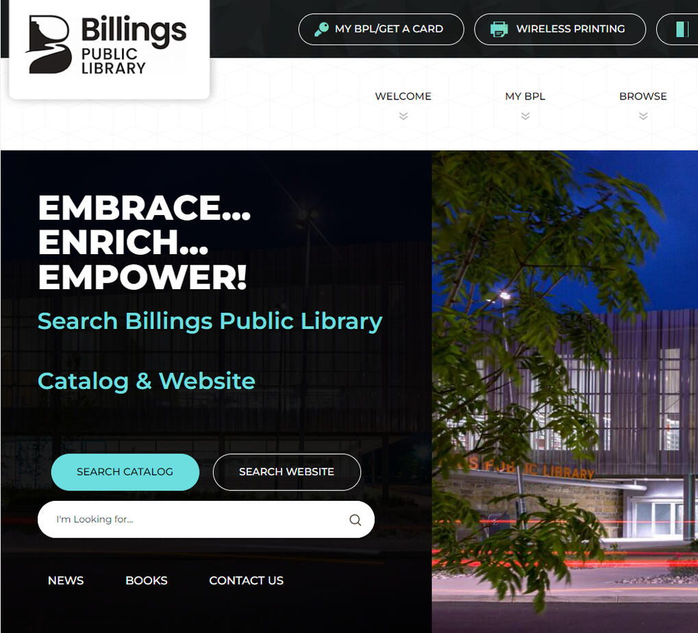
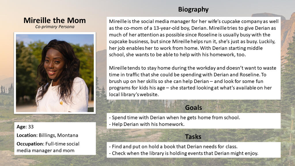
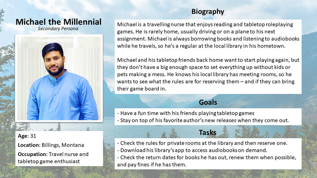
The goal for this project was to access and rework the existing information architecture of the Billings Public Library website.This assessment included field and literature research, three user personas, a full content inventory and analysis, navigational structure testing, low to high fidelity wireframes, wireframe testing, and a full sitemap of the new information architecture.
Site & Mobile App Prototypes
Click here to view this project!
This user research and app prototype project was born from the data collected in a previous class, when the mention of a "one-stop-shop" for transgender information, resources, and community was the clear answer to trans participants' wants, needs, and key tasks.T-STOP resulted in my creation of both a website and app framework.
Accessibility & the WCAG
"Accessibility" has many definitions, but at its core, it means that disabled people can use a product and that the site works well with assistive technology, like screen readers, keyboard navigation, speech recognition, subtitles and captioning, and mobility devices. More specifically, within UX/UI, it refers to a "process of creating products (devices, environments, systems, and processes) which are usable by people with the widest possible range of abilities, operating within the widest possible range of situations (environments, conditions, and circumstances), as is commercially practical."1The Web Content Accessibility Guidelines, or WCAG, is a document that provides guidelines on how to make digital content accessible to people with disabilities, using a rating system from "A" (basic) to "AAA" (advanced) guidelines that websites should (or must, depending on disability laws) follow. The WCAG provides four principles of accessibility that inform their guidelines: Perceivable, Operable, Understandable, and Robust (POUR).The following deliverables detail my full accessibility evaluation process from proposal to implementation.1 Vanderheiden, G.C, and Tobias, J. Universal Design of Consumer Products: Current Industry Practice. Madison, WI: Trace Research and Development Center, 2000.
Accessibility Evaluation
My full accessibility evaluation of Steam.com, carried out using three methods: automated code inspection, manual code evaluation, and experience walkthrough.
After submitting my initial proposal for a three-prong accessibility evaluation of Steam.com, I carried out the evaluations, linked here.The first method, automated code inspection, consisted of running specific pages of the site through SortSite, a program that compares the raw code to accessibility standards in the WCAG.The second method, manual code evaluation, was carried out directly by me. I utilized assistive technology (AT) to navigate the site as well as manual inspection of the code against WCAG standards.
The third method, experience walkthrough, was similar to manual code inspection in that I used AT to review the site, but this time from a practical rather than code-level viewpoint. The intention here was to simulate - to the best of my ability - a disabled user's experience.My final report revealed that Steam.com had 29 accessibility failures as compared to 11 passes and 3 partial passes. The full report shows each WCAG standard and how the site fared, but overall, the project was very eye-opening to the number of issues.
Introduction to IA
Information architecture is a massive field, encompassing a variety of organizational and navigational aspects of site building. The definition I feel summarizes IA the best is: "the synthesis of organization, labeling, search, and navigation systems within digital, physical, and cross-channel ecosystems," from the book Information Architecture: For the Web and Beyond. 1IA concerns many of the most important features of websites, but the only time they are noticeable is when they are confusing or unhelpful. For example, if you have ever gone to a site searching for a specific product or answer to a question and found yourself lost on where to go next, you were experiencing a problem with the site's information architecture (though, admittedly, it is impossible to make IA that works perfectly for everyone).For this project, I evaluated the IA of an existing website, conducted research on users of similar sites, and reworked the existing architecture using personas, a full content inventory, a sitemap that went through multiple iterations, and low to high fidelity wireframes.1 Rosenfeld, Louis; Morville, Peter; Arango, Jorge. Information Architecture: For the Web and Beyond (p. 24). O'Reilly Media. Kindle Edition.
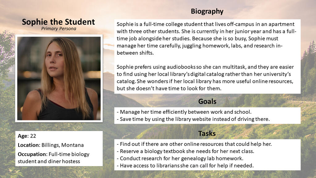
Persona: "Sophie"
The primary persona I created after conducting field and literature research on library website users.
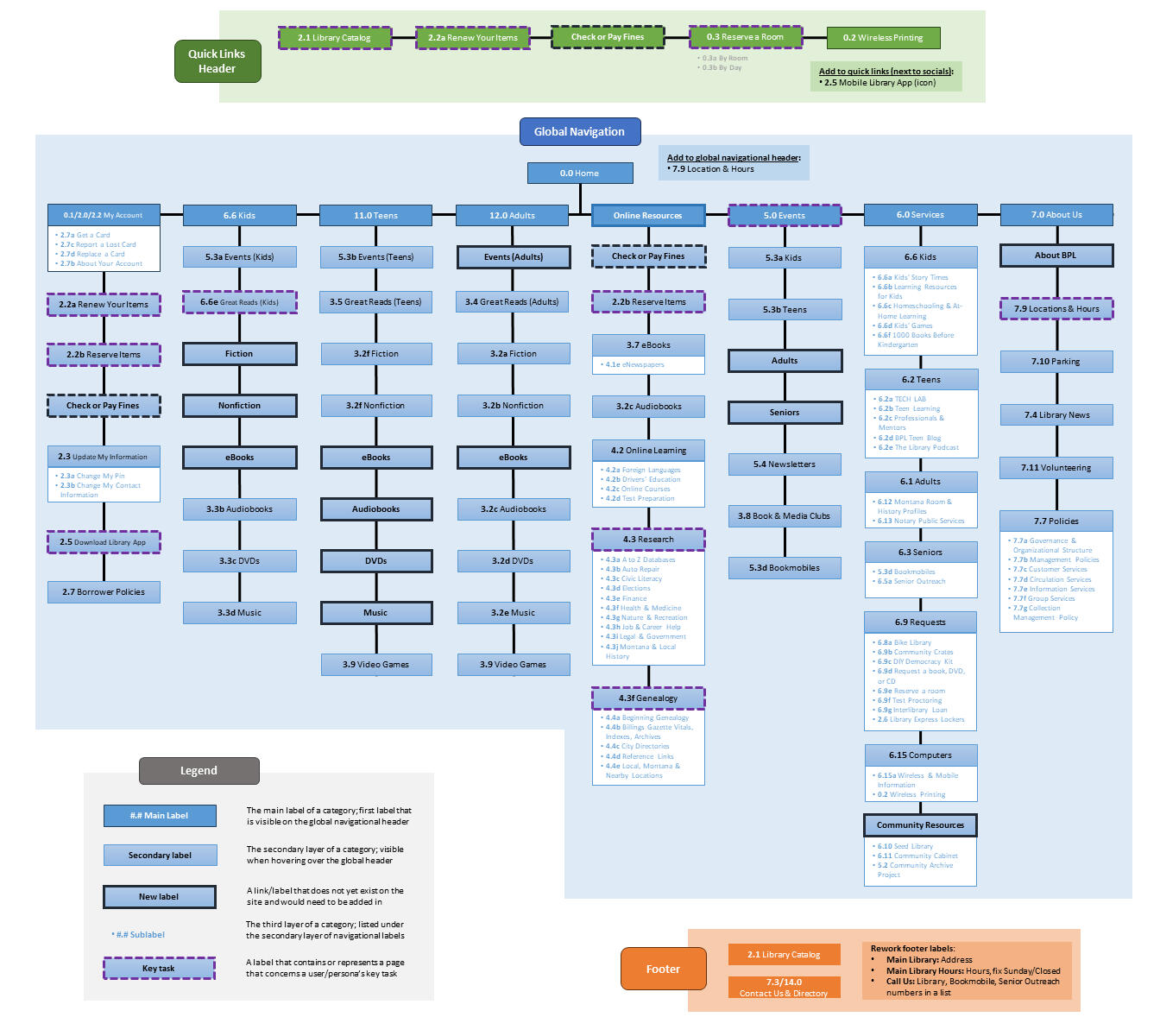
BPL Sitemap
The final sitemap I created for this project, representing all the links that would be in the persistent quick links header, global navigational header, and footer found on every page of the site. This was the final iteration, after creating other versions during earlier stages of the project.
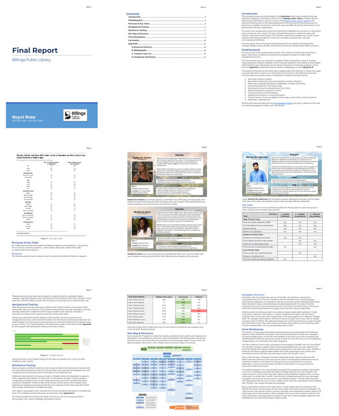
ia assessment
The last deliverable for this project, detailing my research methods and data, personas and key tasks, navigational and wireframe testing, sitemap creation and structure, my final wireframes, and recommendations.
As one of the later projects I completed during my graduate program, this information architecture assessment brought together many of the skills I had learned across courses and disciplines, from research, to personas, to wireframes. I believe it represents the best of my abilities.This assessment taught me the importance of good research and solid information architecture. My research helped me understand users, making personas possible, which then informed my wireframes and navigational structure.
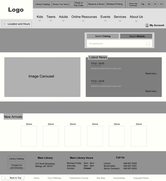
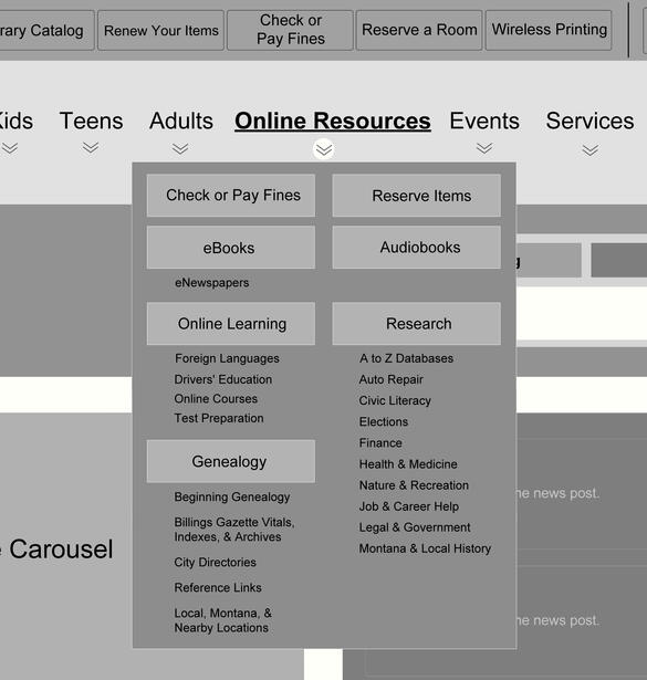
Interaction Wireframes
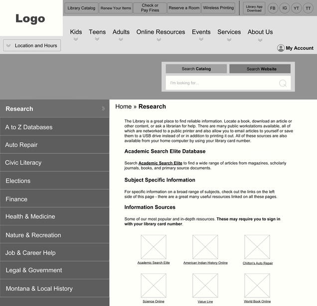
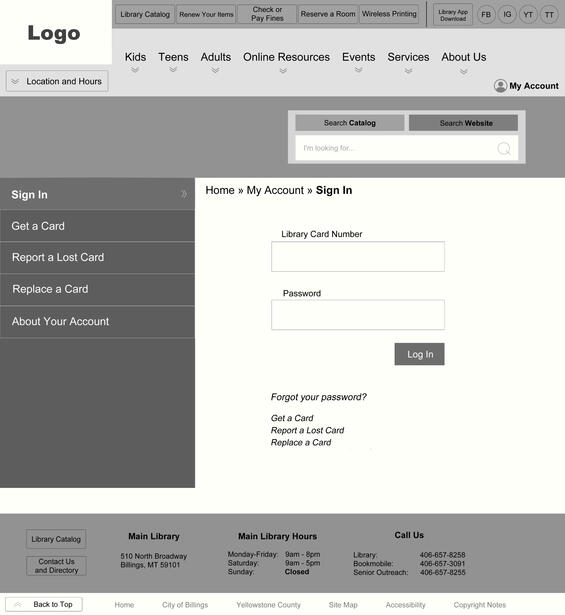
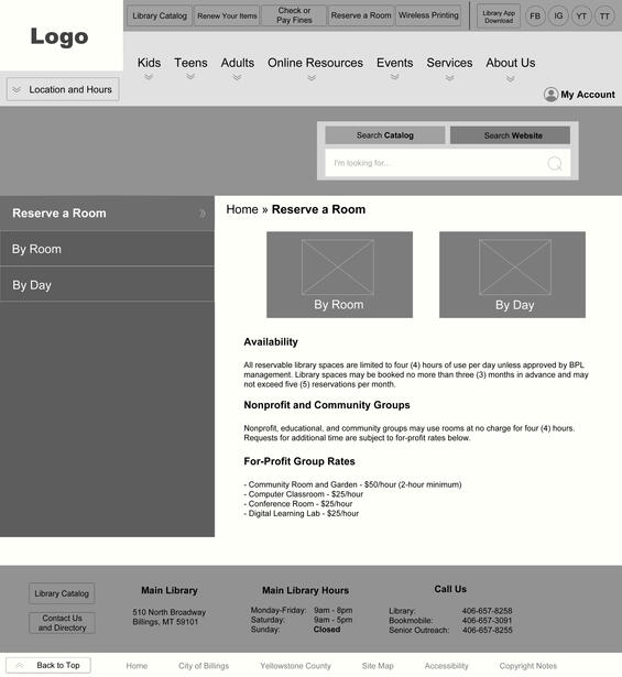
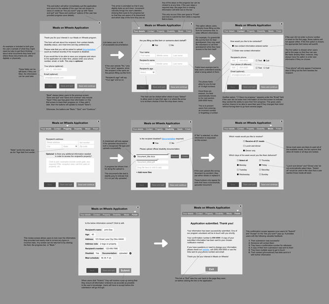
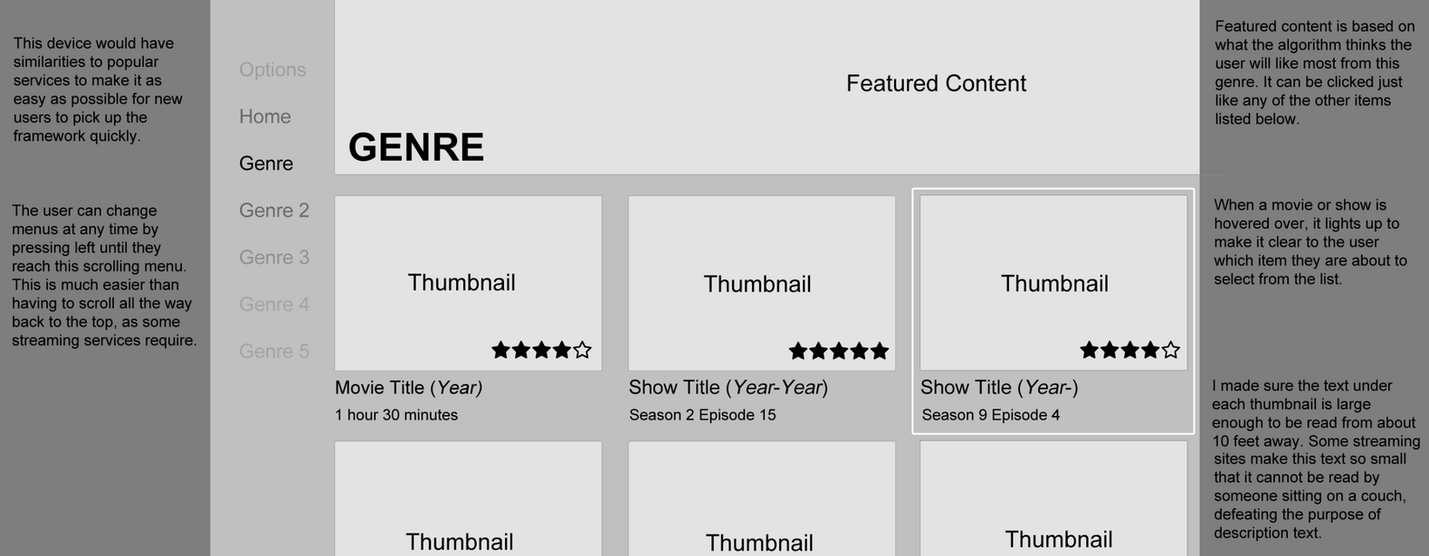
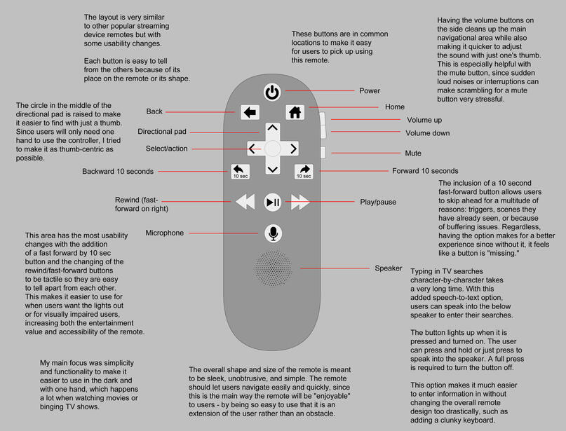
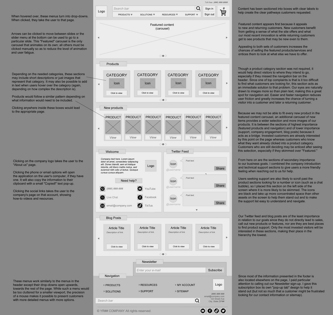
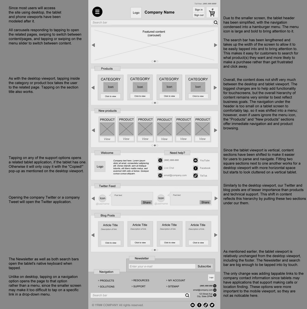
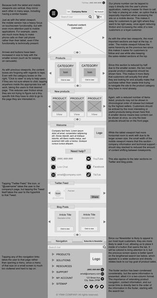
A smorgasbord of wireframes created for Principles of Interaction, demonstrating my ability to plan out and execute wireframes for a variety of purposes, visual hierarchies, breakpoints, and device layouts.
Type System Example
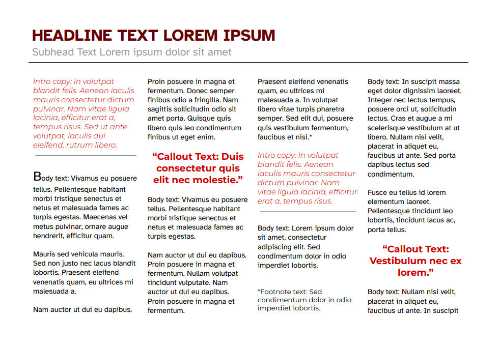
A specimen page to showcase font families, colors, spacing, and text size, styled to look like a magazine interview.
A type system sampling a recently published font, Atkinson Hyperlegible, that was designed with low-vision readers in mind. I chose Hyperlegible as the main font, but varied the font size, color, and weight to establish a visual hierarchy.Each section flows with the others without sacrificing intrigue or legibility. The colors, size, and weights of each text indicate its role within the hierarchy and naturally lead the reader from section to section.


